how (not) to get a book cover designed
Like most of my breakthroughs beyond the actual writing of the book, finding my cover designer was eventually achieved through a contact. By contact, I mean a girl I met in a nightclub who messaged me on Instagram. She was a fashion designer and when I said I was needed a book cover, she directed me to her friend Adam who designs packaging for craft drink brands.
Before that though, I was to learn a few lessons.
the vision - what I wanted from a book cover
I knew that most sports books are covered with a photo of the protagonist's face. I did not want this for several reasons:
fame - most of the people who write or have a sports book written about them are famous for their exploits. I am not. I wanted the cover to reflect my everyman status in the professional sports firmament. A graphic cover would suit this purpose while a photo would seem grandiose.
difference - part of my narrative and the selling point of the book is that it's a different story, one not told by the usual sports book. I wanted the cover to reflect this difference. If I had the same design as most other sports books, my book would be just another one when I wanted it to stand out.
France - I wanted the cover to contain an element of France. At this point I was still using my working title of 'Lost In France' but I wasn't set on it and thought the cover would be a better way to communicate the French connection than the title or subtitle.
taste - I think the usual cover, a straight up photo of someone's face, is hackneyed, dull and not to my taste. I wanted my cover to be something that I could be pleased to see in reality or on a shelf. Something well-designed that I could be proud of and a point of interest in its own right.
pictures - I also don't like having my picture taken. That's that really.
a foray into the world of Fiverr
So, despite wanting something of high quality, something that could stand alone as a piece of art, something that would stand out in a sea of sports books, I'm still essentially quite tight and wanted to get this done as cheaply as I could.
So I headed to Fiverr.
Fiverr is cheap marketplace where I believe everything used to cost $5, but now you can commission things like design work at a range of prices. I thought that I could brief someone, give them some examples and see what they came up with. I might find a diamond in the rough. Even if I didn't, I'd practise commissioning design work and briefing someone. It seemed fine.
I found someone with some reasonable looking work and a very reasonable price. We started talking and I commissioned them to do my cover.
how explaining my brief led to one unhappy customer
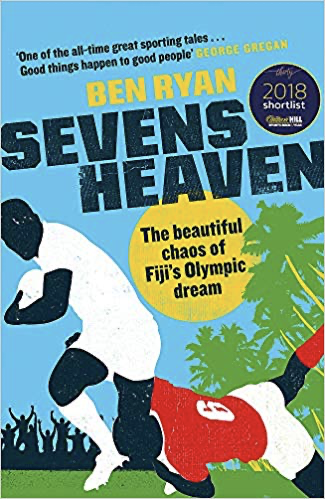
What I wanted was basically a French version of the cover of Ben Ryan's book about coaching the Fiji 7s team. I envisaged a silhouette of a rugby player in some sort of identifiably French setting.
This could be done by incorporating a flag or the colours rather than landmarks but I was open to ideas.
(Ryan’s book is awesome and well worth a purchase)
Read more about his book and other sports books I recommend here.
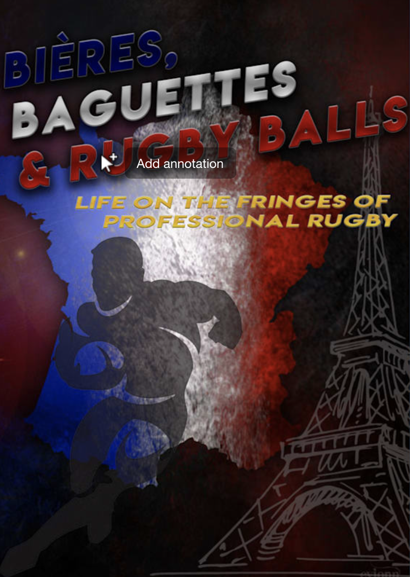
I'd also decided to have some fun with the title and submitted the non-serious 'Bières, Baguettes and Rugby Balls with my working title as part of a subtitle.
My exact words to the designer were:
“I’d like a graphic/illustrated cover that conveys:
that the book takes place in France - this could maybe be done through the French blue/white/red colours or using a flag
that the book is about rugby
that is a clean and striking design, not overly fussy”
what he came up with…
I received these designs, each coming after requesting revisions.
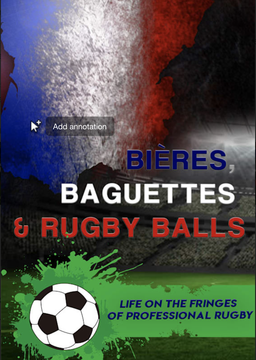
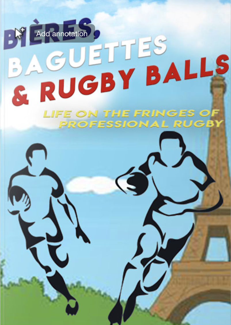
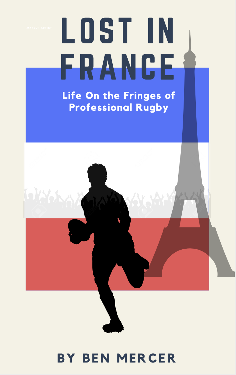
As you can imagine, I began to despair of this and eventually, I mocked one up myself in Canva and sent it to him as a guide but also partly to prove I could make something better myself in 5 minutes. I've provided my effort below on the right, next to the final design he provided.
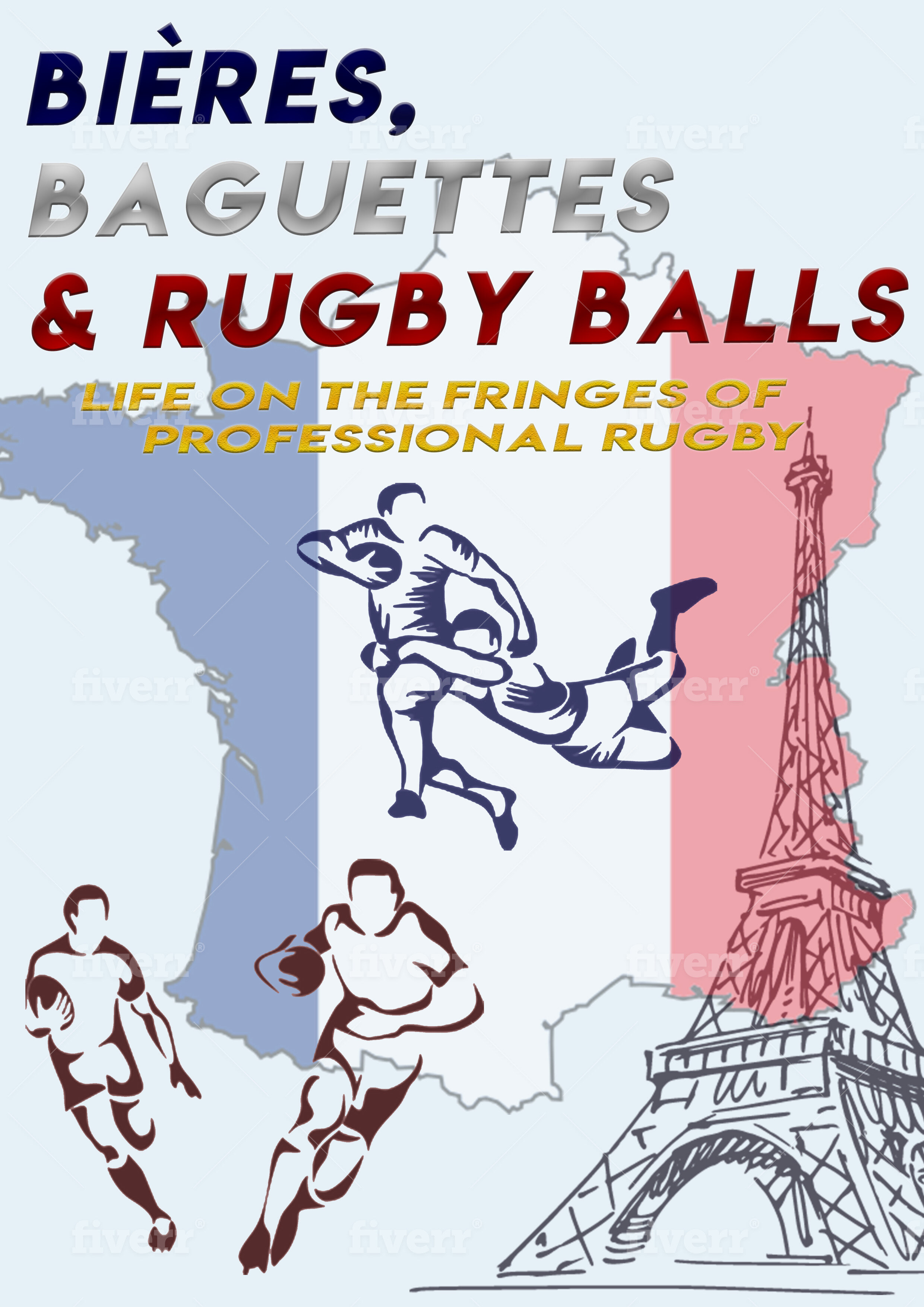
Bear in mind too, that this was the designer's best effort.
After that debacle, I resolved to look for a proper designer. How was the question.
enter Adam McCarthy
This was where my nightclub adventure came in handy - to think that if I hadn't gone up to London on the spur of the moment, it wouldn't have happened. A true Sliding Doors experience, although totally devoid of romance.
I spoke to Adam. Book covers were not his area of expertise but I liked the idea of him adapting the bold, colorful beer cans he designs to stand out on supermarket shelves to my book that needs to jump out from the screen of the Amazon marketplace.
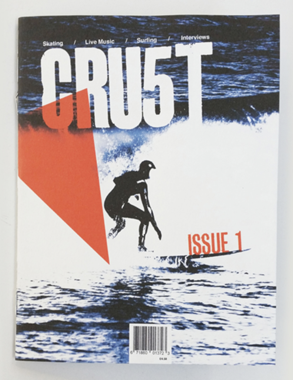
Most encouragingly though, it turned out that he'd designed the cover of a surf magazine before, one that came very close to what I imagined for the recently retitled Fringes. I awaited his designs with a bit of trepidation but also some excitement.
Adam’s initial designs
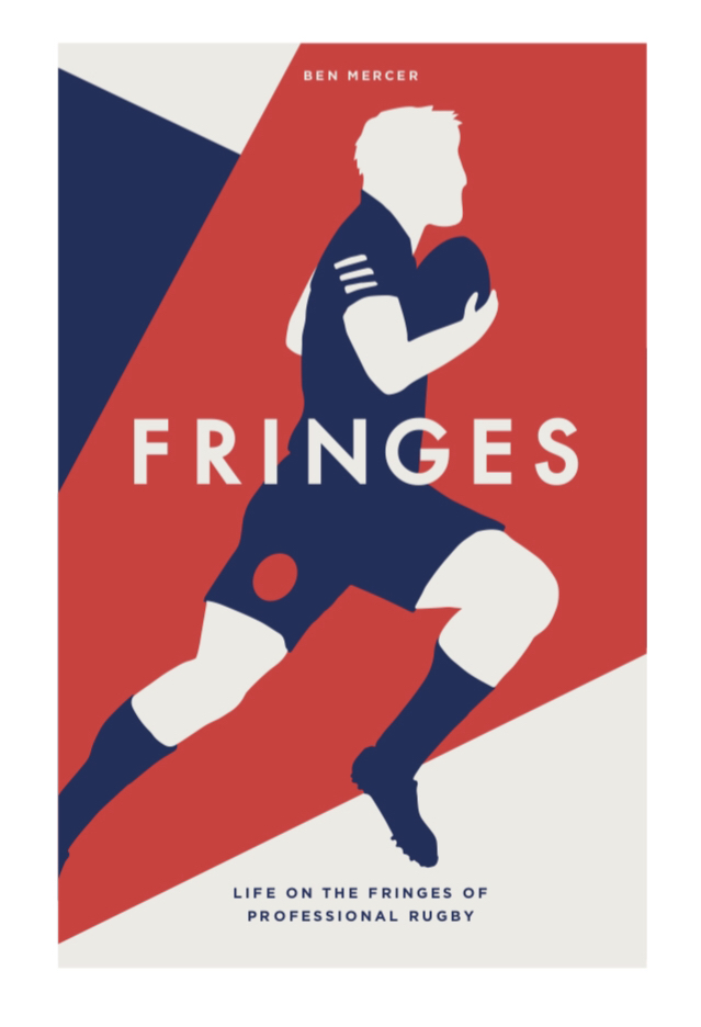
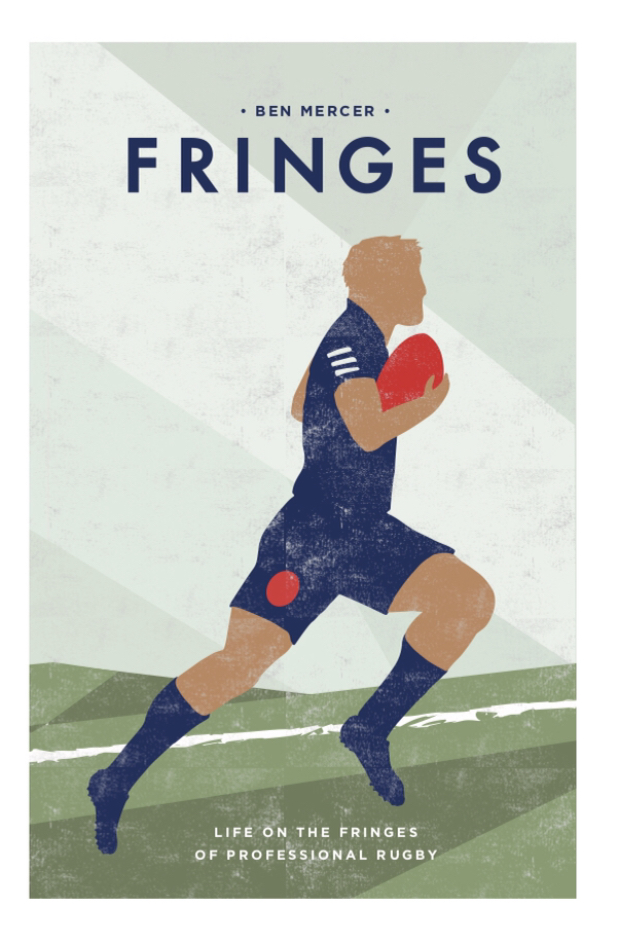
Here are the 2 designs he very swiftly came up with:
I was absolutely delighted.
They captured what I'd envisaged for the cover in such a striking way. I loved both of them but they were obviously very different.
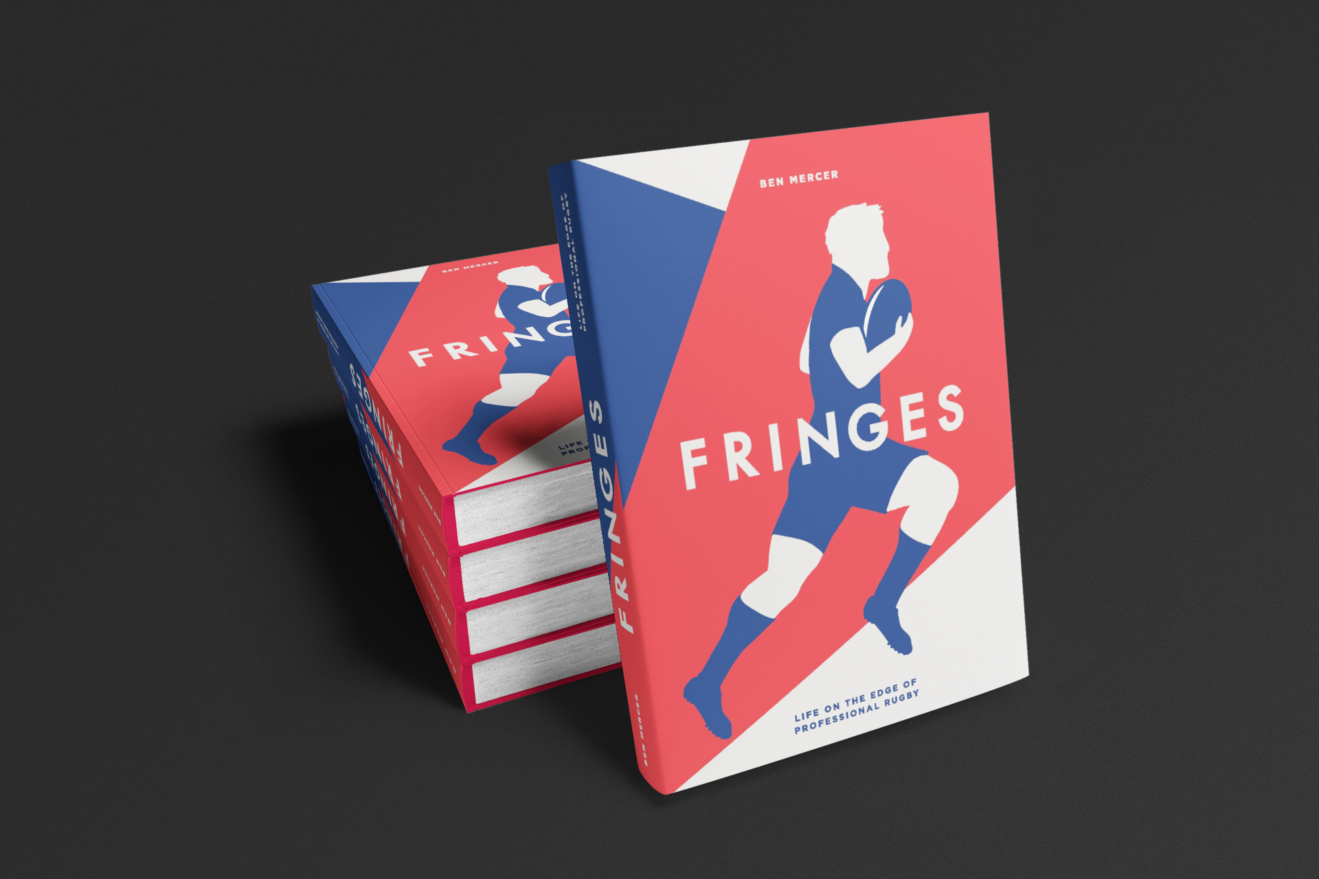
The first was more striking, with the perfect bold design and colours to stand out on Amazon. It also looked slightly old school, with strong lines and the ideal French colour scheme.
The second appeals slightly more to my millennial, faded pastel sensibility and I loved the slight air of desolation that it had about it. This player was alone, in a field rather than a stadium and he appeared to be running uphill, a fine metaphor for the sporting career I was describing. It was also slightly distressed, as if it had been discovered somewhere and had been well read.
My initial thoughts were that although I loved both, the first design would be best for my purposes, with a couple of small tweaks. The French national team kit used in both was a bit misleading and needed to go but somehow the French connection of the book had to be made clear now that I’d changed the title of the book. Good thing then, that I now had an email list to share the designs with.
I put it to them and the response rate was huge! If you're ever wondering how to increase your email engagement, this is it.
I also posted to a Facebook group I discovered where independent authors give feedback on each others' book covers. The results were similar to my email list where the red/blue/white cover was the resounding favourite.
I did receive a couple of interesting negative comments though. While some said the red one was 'badass', someone else said,
The right looks like a hundred outdated sports books from the 70s.
Then when asked for examples:
Nope. I'm still in bed. But I used to sell used books, and this style of book cover would come in and go straight to the refuse because the resale value was so low.
The Facebook group gave some more technical suggestions with things like increasing the size of the author name and changing the colour of the ball to make it stand out. Some also said that the alternative cover looked,
targeted at a younger audience and looks like a textbook
A comparison I hadn't considered! I went with consensus and my initial feeling, selecting the bolder cover design.
the end result
All's well that ends well and my book came to life. Adam and I refined the design slightly, removing the detail from the player's kit and adding an accent to the ball to make it stand out. I paid him a little extra for the 2nd design as well which I've used for a few Christmas labels and some promotional posts. I think it would make an excellent design for a rugby themed greeting card as well.
Getting the cover designed was a learning experience but amazingly, with the whole wide world of the internet available to find people, it turned out that speaking to strangers gave me an incredible result. It’s yet more proof that once you start to move in a direction, solutions begin to present themselves. If you have a creative project on the go, speaking about it to everyone is your best bet as you never know where you'll find the right help.